📖 正文内容
【唐】三三
- 扩展
- 订阅
bootstrap 5 样式复习
- 1.1 Display 显示 .d-*#
- 1.5 Position 定位#
- 2.2 文本换行溢出#
- 2.3 文字分割#
- 2.5 字体大小 fs-*#
- 2.7 行高 .lh-*#
- 3.1 颜色 colors#
- 3.2 阴影 shadow#
- 3.4 边框 boder#
- 5.2 flex 布局#
布局#
内容#
公共样式#

1.基础样式#
1.1 Display 显示 .d-*#
- .d-*(例如,.d-none): 根据屏幕尺寸显示或隐藏元素。
- .d-none: 在给定屏幕尺寸下隐藏元素。
- .d-block: 在给定屏幕尺寸下显示块级元素。
- .d-inline: 在给定屏幕尺寸下将元素设置为行内元素。
- .d-inline-block: 在给定屏幕尺寸下将元素设置为行内块元素。
指定屏幕尺寸隐藏元素(响应式)
1.2 间距(Spacing)- 边距和填充类#
其中属性是以下之一:
- m- 对于设置margin的类
- p- 对于设置padding的类
其中边 是以下之一:
- t- 对于设置margin-top或padding-top的类
- b- 对于设置margin-bottom或padding-bottom的类
- s- 对于设置margin-left或padding-left的类(在 LTR),margin-right或padding-right的类(在 RTL)
- e- 对于设置margin-right或padding-right的类(在 LTR),margin-left或padding-left的类(在 RTL)
- x- 对于设置*-left和*-right的类
- y- 对于设置*-top和*-bottom的类
- blank- 用于在元素的所有4个边上设置margin或padding的类 (空白的意思,例如 m-2)
其中 size是以下之一:
- 0- 对于通过将其设置为0来消除margin或padding的类
- 1- 默认情况下)对于将margin或padding设置为$spacer * .25的类
- 2- 默认情况下)对于将margin或padding设置为$spacer * .5的类
- 3- 默认情况下)对于将margin或padding设置为$spacer的类
- 4- 默认情况下)对于将margin或padding设置为$spacer * 1.5的类
- 5- 默认情况下)对于将margin或padding设置为$spacer * 3的类
- auto- 对于将margin设置为auto的类
水平居中 mx-auto#
margin 和 padding#
- .m-*(例如,.m-3): 上边距。
- .mt-*(例如,.mt-3): 顶部边距。
- .mb-*(例如,.mb-3): 底部边距。
- .ml-*(例如,.ml-3): 左边距。
- .mr-*(例如,.mr-3): 右边距。
- .p-*(例如,.p-3): 内边距。
- .pt-*(例如,.pt-3): 顶部内边距。
- .pb-*(例如,.pb-3): 底部内边距。
- .pl-*(例如,.pl-3): 左边内边距。
- .pr-*(例如,.pr-3): 右边内边距。
- .py-*:垂直填充。
- .px-*:水平填充。
负边距 mt-n1#
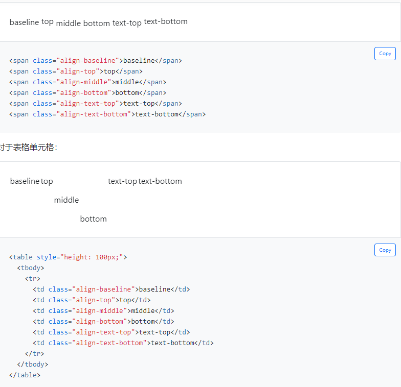
1.3 垂直对齐 Vertical aligin#
垂直对齐只影响inline、inline-block、inline-table和表单元元素(table cell)。
1.4 float 浮动 .float-*#
三个属性:
响应式 float-sm-*
- sm(> = 576px)
- md(> = 768px)
- lg(> = 992px)
- xl(> = 1200px)
- xxl(> = 1400px)
1.5 Position 定位#
快速定位 .position-*#
- .position-static: 将元素设置为静态定位。
- .position-relative: 将元素设置为相对定位。
- .position-absolute: 将元素设置为绝对定位。
- .position-fixed: 将元素设置为固定定位。
- .position-sticky: 将元素设置为粘性定位。
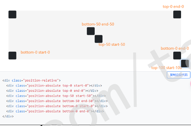
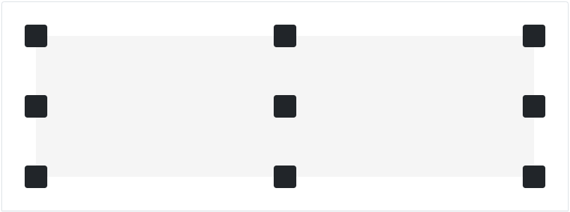
元素排列#
其中 属性 是以下之一:
- top- 用于垂直top位置
- start- 用于水平left位置 (in LTR)
- bottom- 用于垂直bottom位置
- end- 用于水平right位置 (in LTR)
其中 位置 是以下之一:
- 0- 表示0边缘位置
- 50- 表示50%边缘位置
- 100- 表示100%边缘位置
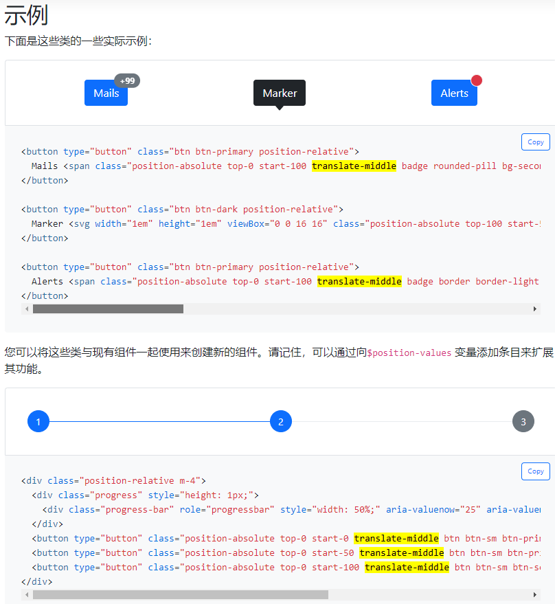
居中元素 .translate-middle#
居中的示例:#
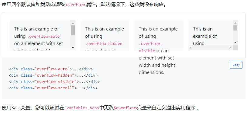
1.6 Overflow 溢出 .overflow-*#
1.7 隐藏显示元素(Visibility)*被废弃#
- .hidden-*: 元素在指定屏幕尺寸下隐藏。
- .visible-*: 元素在指定屏幕尺寸下显示。
visibility
hidden
2 文本样式#
2.1 文本对齐 .text-center#
- .text-left: 文本左对齐。
- .text-right: 文本右对齐。
- .text-center: 文本居中对齐。
- .text-justify: 文本两端对齐。
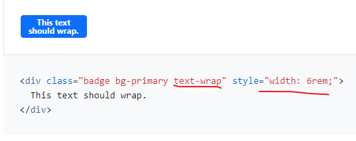
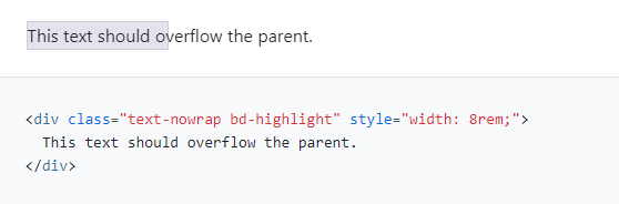
2.2 文本换行溢出#
换行 .text-wrap#
溢出(禁止使用)#
2.3 文字分割#
防止长字符串打断组件的布局 .text-break

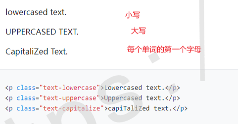
2.4 大小写组件 text-lowercase#
Lowercased text.
Uppercased text.
CapiTaliZed text.
2.5 字体大小 fs-*#
.fs-1 text
.fs-2 text
.fs-3 text
.fs-4 text
.fs-5 text
.fs-6 text
2.6 字体加粗 .fw-* 和斜体 .fst-*#
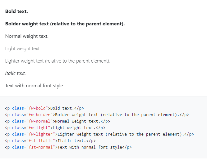
字体类:
- .font-weight-bold: 加粗字体。
- .font-weight-normal: 正常字体。
- .font-weight-light: 轻量级字体。
- .font-italic: 斜体字体。
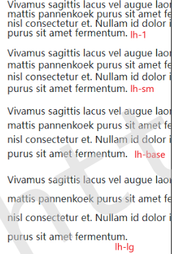
2.7 行高 .lh-*#
Vivamus sagittis lacus vel augue laoreet rutrum faucibus dolor auctor. Donec sed odio dui. Cras mattis pannenkoek purus sit amet fermentum. Praesent commodo cursus magna, vel scelerisque nisl consectetur et. Nullam id dolor id nibh ultricies vehicula ut id elit. Cras mattis consectetur purus sit amet fermentum.
Vivamus sagittis lacus vel augue laoreet rutrum faucibus dolor auctor. Donec sed odio dui. Cras mattis pannenkoek purus sit amet fermentum. Praesent commodo cursus magna, vel scelerisque nisl consectetur et. Nullam id dolor id nibh ultricies vehicula ut id elit. Cras mattis consectetur purus sit amet fermentum.
Vivamus sagittis lacus vel augue laoreet rutrum faucibus dolor auctor. Donec sed odio dui. Cras mattis pannenkoek purus sit amet fermentum. Praesent commodo cursus magna, vel scelerisque nisl consectetur et. Nullam id dolor id nibh ultricies vehicula ut id elit. Cras mattis consectetur purus sit amet fermentum.
Vivamus sagittis lacus vel augue laoreet rutrum faucibus dolor auctor. Donec sed odio dui. Cras mattis pannenkoek purus sit amet fermentum. Praesent commodo cursus magna, vel scelerisque nisl consectetur et. Nullam id dolor id nibh ultricies vehicula ut id elit. Cras mattis consectetur purus sit amet fermentum.
2.8 等宽字体 .font-monospace#
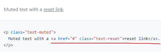
2.9 重置颜色 .text-reset#
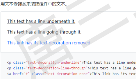
2.10 文本修饰 text-decoration-*#
This text has a line underneath it.
This text has a line going through it.
3 视觉样式#
3.1 颜色 colors#
文本颜色 text-*#
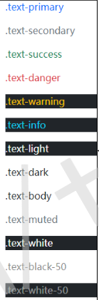
.text-primary
.text-secondary
.text-success
.text-danger
.text-warning
.text-info
.text-light
.text-dark
.text-body
.text-muted
.text-white
.text-black-50
.text-white-50
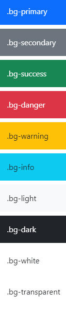
背景颜色 bg-*#
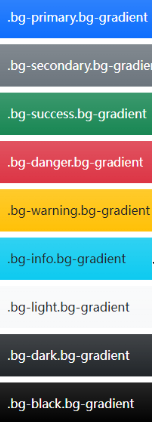
渐变色 .bg-gradient#
背景颜色类:
- .bg-primary: 主要背景颜色。
- .bg-secondary: 次要背景颜色。
- .bg-success: 成功状态背景颜色。
- .bg-danger: 危险状态背景颜色。
- .bg-warning: 警告状态背景颜色。
- .bg-info: 信息状态背景颜色。
文本颜色类:
- .text-primary: 主要文本颜色。
- .text-secondary: 次要文本颜色。
- .text-success: 成功状态文本颜色。
- .text-danger: 危险状态文本颜色。
- .text-warning: 警告状态文本颜色。
- .text-info: 信息状态文本颜色。
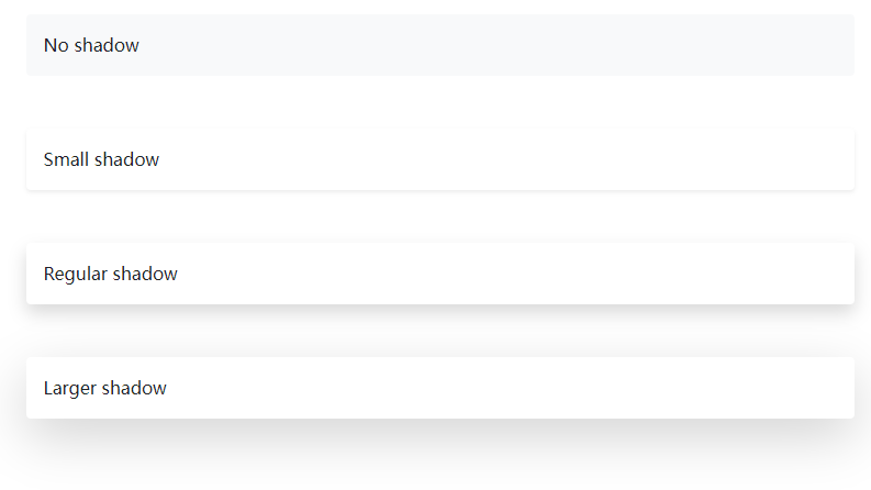
3.2 阴影 shadow#
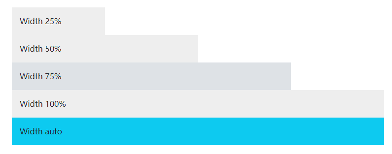
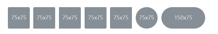
3.3 调整大小 Sizing : 宽度和高度#
相对于父元素#
宽度 w-*
高度 h-*
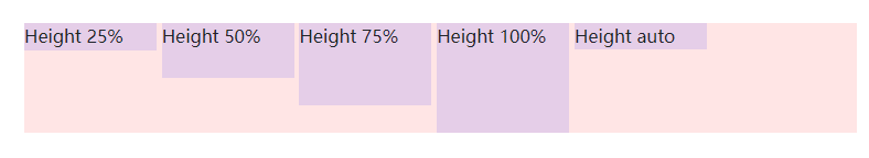
相对于窗口 vw-*/vh-*#
您还可以使用实用工具来设置相对于视口的宽度和高度。
3.4 边框 boder#
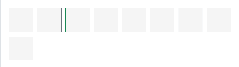
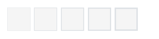
边框圆角 rounded-*#
向元素添加类,使其易于圆角美化。
边框圆角大小 rounded-*#
边框类:
- .border: 为元素添加边框。
- .border-0: 移除元素的边框。
- .rounded: 为元素添加圆角。
- .circle: 将元素设置为圆形(常用于图标)。
4 交互样式#
文本选择(整句或不能选择) user-select-*#
当用户与内容交互时,改变选择内容的方式。
user-select-auto: 默认
user-select-all:选择整句
user-select-none:不能选择
This paragraph will be entirely selected when clicked by the user.
This paragraph has default select behavior.
This paragraph will not be selectable when clicked by the user.
交互事件 (.pe-none阻止事件)#
This link can not be clicked.
This link can be clicked (this is default behavior).
This link can not be clicked because the pointer-events property is inherited from its parent. However, this link has a pe-auto class and can be clicked.
5 特殊样式#
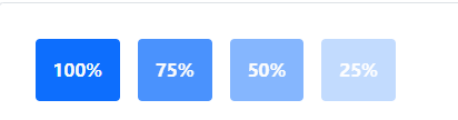
5.1 Opacity透明度 .opacity-{value}#
5.2 flex 布局#
参考:#
(6.2)弹性布局 2022-02-15
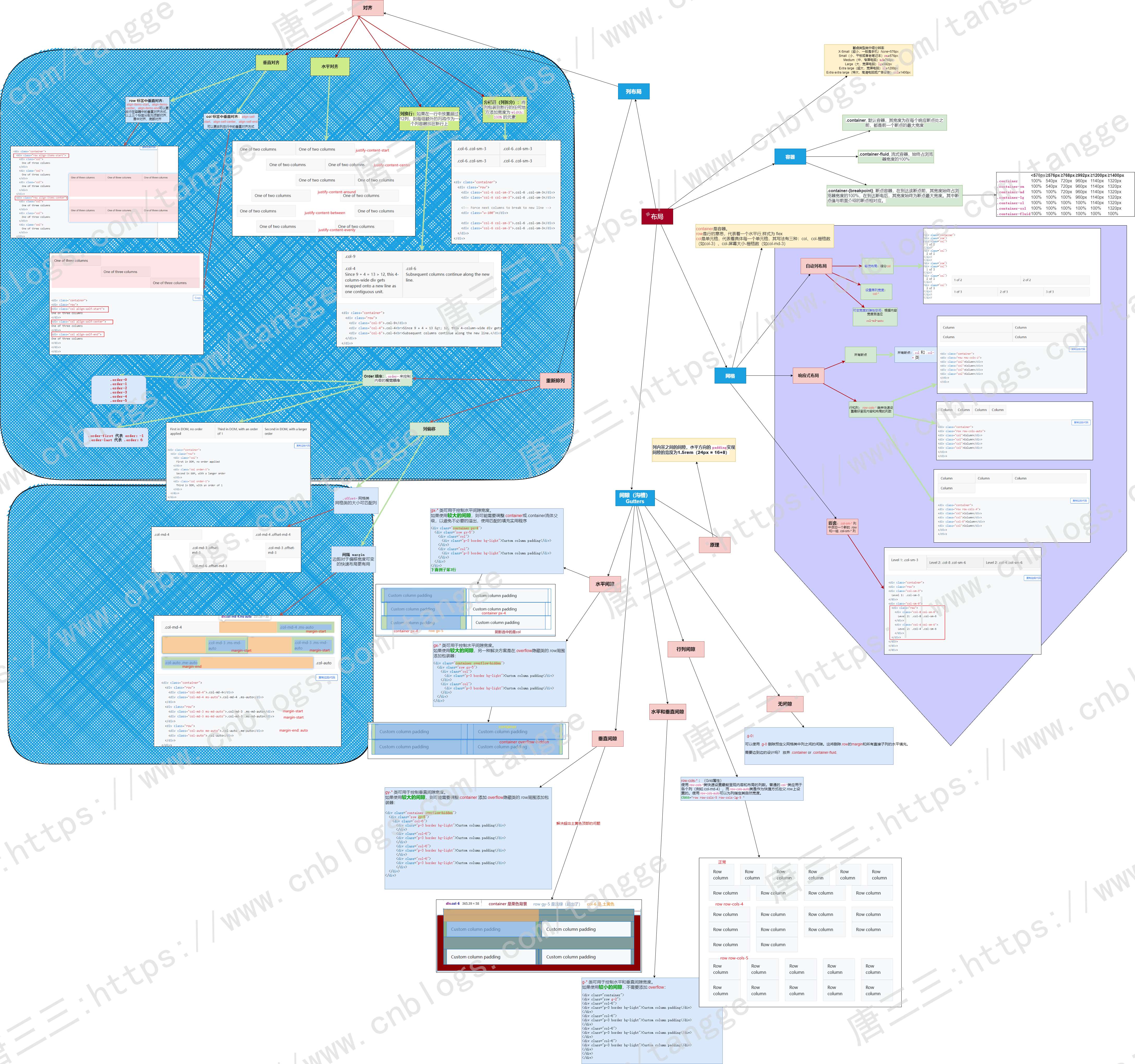
6 布局容器类#
- .container,它设置每个响应断点的最大宽度(max-width)
- .container-fluid, 所有断点的宽度为100%(width: 100%)
- .container-{断点规格}, 宽度100%(width: 100%)直到指定的断点
- .container: 固定宽度居中的容器。
- .container-fluid: 占据全屏宽度的容器。
超小屏幕 <576px | 小屏幕 ≥576px | 中等屏幕 ≥768px | 大屏幕 ≥992px | 超大屏幕 ≥1200px | 超大型屏幕 ≥1400px | |
|---|---|---|---|---|---|---|
.container | 100% | 540px | 720px | 960px | 1140px | 1320px |
.container-sm | 100% | 540px | 720px | 960px | 1140px | 1320px |
.container-md | 100% | 100% | 720px | 960px | 1140px | 1320px |
.container-lg | 100% | 100% | 100% | 960px | 1140px | 1320px |
.container-xl | 100% | 100% | 100% | 100% | 1140px | 1320px |
.container-xxl | 100% | 100% | 100% | 100% | 100% | 1320px |
.container-fluid | 100% | 100% | 100% | 100% | 100% | 100% |
默认容器 .container#
流式布局 .container-fluid#
响应式容器 container-*#
行和列类:
- .row: 用于定义行,默认有一个15px的左右外边距。
- .col-*(例如,.col-sm-4): 用于定义列,可以使用不同的类来指定不同屏幕尺寸下的列宽。
列表样式类:
- .list-group: 定义一个列表组。
- .list-group-item: 定义列表组中的一个项目。
- .list-group-item-heading: 定义列表组中项目的标题。
- .list-group-item-text: 定义列表组中项目的文本内容。
面板样式类:
- .panel: 定义一个面板。
- .panel-default: 定义一个默认样式的面板。
- .panel-heading: 定义面板的头部。
- .panel-title: 定义面板的标题。
- .panel-body: 定义面板的内容部分。
- .panel-footer: 定义面板的脚注部分。
其他常用类:
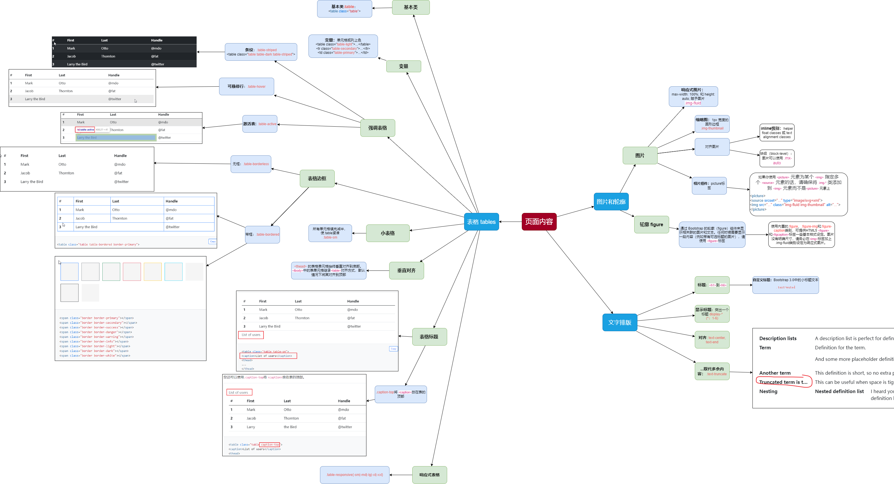
- .img-fluid: 使图像能够响应式地填充容器。
💬 评论交流
这个技巧很实用,感谢分享!